Flipboard vs Currents vs Pulse
Slowly but consistently, our smartphones have been replacing computers and newspapers as our source for news. The screens have grown bigger. The displays have gotten better (and more vibrant). And of course, we have great apps that consolidate all our news social feeds in one place for easy viewing. Flipboard, Google Currents, and Pulse happen to be among the most popular news reader apps in the world right now, having been downloaded more than 30 million times together on the Play Store. Here’s a comparison of the three from an Android perspective.

Interface
Common to all the apps is a homescreen where news is categorized based on your interests.
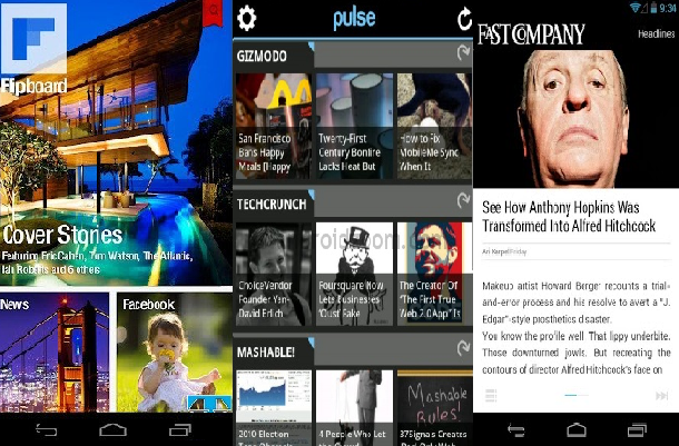
Flipboard provides the closest to a magazine-like experience, where, as its name suggests, you ‘flip’ over the pages on an article while you read – and that’s actually pretty fun. Unfortunately, the flip feature doesn’t seem to work with every news provider. Sites like Pocketlint, for example, only give you a scrollable version of its articles. Some others only display an image along with a single sentence, and the user is forced to open the web version of the article for further viewing. Not very nice.
Flipboard lets you sign in via your Facebook account, and brings in your newsfeed to the app as well. The popular stories end up in “Cover Stories” right at the top. Flipboard’s interface follows the same pattern throughout the app, makes the most use of your screen size, and ends up with a very slick look. The disadvantage however: Flipboard only lets you see one article at a time. Continuously flipping to pick an article that might interest you can be a pain.
Currents follows a different, and perhaps better path – and lets you see multiple items from a news provider at once in a screen. The articles are visible as a thumbnail version in one page, letting you see multiple items at once before you choose to open any one of your choice. The posts keep popping up with a subtle animation seen in other Google apps – like Google+. Instead of flipping up and down, users need to swipe left and right to go through pages or go to the next article. Currents, unlike Flipboard, also lets you move between different categories – say from Business to Tech – with a swipe.
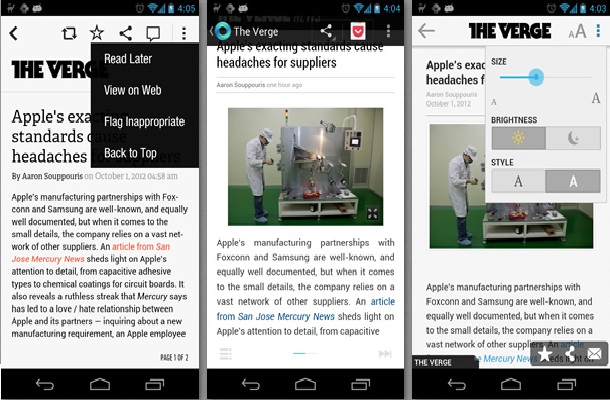
Pulse adopts a hybrid approach. Like Flipboard, users need to scroll from top to bottom for reading a post. But like Currents, you’ll need to swipe horizontally to switch between articles. The homescreen however, ends up looking pretty cramped. The idea is to fit in as much information as it can into a single page for easy viewing. Thus we have about 9 small thumbnails from 3 different providers all on one page. Whether you’d find this convenient is really a matter of personal preference. Moving on, you have the option to read posts with a bright white background or a dark black theme. You also get the option to view the article on the web directly.
Pulse loses out to Currents and Flipboard in this category, owing to its cramped feel. Flipboard and Currents would be even.
Content
All the 3 apps basically perform the same function – aggregating news from different sources based on your interest, to one place for easy reading. What differentiates one from the other is how this aggregation is pulled off.
Flipboard gets you news from any provider you subscribe to, along with your social feed as well. It supports multiple account logins. Another great feature: it supports Audio feeds. Additionally, Flipboard automatically picks the most trending and interesting articles from varied sources and puts them together in a place called “Flipboard Picks”. More often than not, these articles are interesting enough, and actually do deserve a spot in Flipboard Picks. This feature works.
Currents offers different tabs – like “Recommended” and “Pick of the week”, which strive to serve the same purpose as Flipboard Picks, and do succeed.
Pulse offers a “Recommended” section as well – the sources are based on your online behaviour, and the popularity of the source itself. However, it does not feature any picks of its own.
Overall, all the apps do a great job with the quality of the news content, but Flipboard wins here due to its Picks feature, which works best.
3rd Party Integration
3rd party integration is a vital feature. You’ll definitely want to share an interesting article with your friends, or maybe even save it for later reading. All 3 apps make use of Android’s sharing features, allowing for easy sharing to anything from social network, to almost any other app.
Flipboard offers plenty of options to work with other apps. For offline reading for example, you can use anything from Pocket and Instapaper to Readability to save your articles for later. Pocket even lets you read your articles on other machines. Social integration is pretty much flawless. The share icon atop every screen lets you share via Facebook, tweet, and post to your Google+ circles, among many other options.
Currents on the other hand, does not allow for any integration with any third party app. For offline reading, a single taps saves the article, and it goes into a different section called “Saved”. To read stuff offline, that’s the only place you can go to.
Pulse gets everything right here – articles can be saved to third party apps for offline reading. Sharing articles to your social network is easy thanks to just one tap. You can even see which of your friends is using Pulse, and “highlight” articles for them.
Although not drastically different in usage, Currents does lose out slightly here on offline-reading ability, both to Flipboard and Pulse.
Functionality
There’s nothing to separate any of the three in terms of functionality. Each one offers the same quality of features. It’s easy to work around all 3 apps – users can choose categories of their interests, and news from different providers is automatically packed in. Of course, you have the option to manually add your own providers as well.
All 3 apps also allow for basic UI customizations – font size can be adjusted. Pulse goes one step ahead and provides 2 themes though – the dark black theme, in particular, manages to look pretty good.
Background sync is supported for all the apps – and you have the option to stick to Wi-Fi only to conserve mobile data. Flipboard offers slightly more customizability with these options – there are different variations for how you might want to save mobile data – you can choose to load just the headlines, images .etc
Verdict
All 3 apps are more or less on par in terms of functionality and content. Currents and Flipboard though, have a more clean and likeable UI than Pulse. And with the 3 apps coming out, more or less, on most comparison benchmarks, its only the UI that separates them. I have been a Flipboard fan for a long time, but after trying out Currents, I haven’t gone back. Current’s clean look, and the fact that I can see more items on my screen at once, works in its favour. The same criteria rules out Pulse.
Plus, Pulse does not bring you any random interesting stuff like the other apps do. Highlights from your friends is the most you can get.
The choice between Currents and Flipboard then, would just depend on your preference between the interface of the two.
Flipboard can be downloaded from the Play Store here.
Currents can be downloaded here.
Pulse can be downloaded here.


