Apple vs. Google: Let the Map Wars Begin
With the debut of iOS 6, Apple took the liberty of replacing Google Maps with their own ‘built from the ground up’ maps application. More recently, Google Maps retaliated by releasing an app of their own. Since its release, Google Maps has skyrocketed to the top of the ‘most downloaded app’ list. Now, endowed with a choice, many critics have been sounding off about the differences, advantages, and ultimately, which app comes out on top. After reading a ton of reviews, it seems the jury is still out on which app reigns supreme. I decided, with a split decision such as this, it’s better to decide for myself.
The first, and most obvious, comparison to make is the photo quality of the satellite imagery provided by each application. Whether you are scoping out the Great Barrier Reef or checking out your back yard, high quality images are an absolute must. I mean, if you can’t see your own car in your own driveway, then really, what CAN you see?
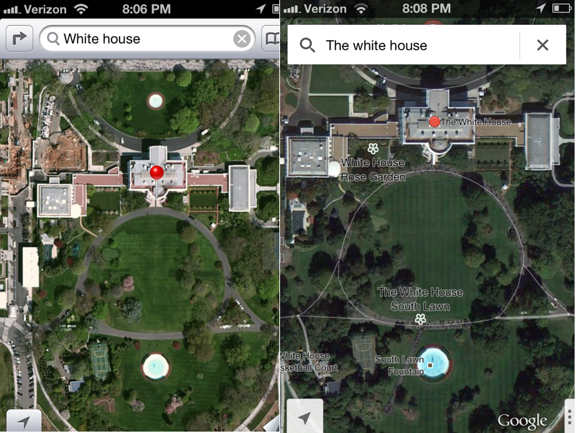
Here is a side-by-side photo comparing satellite images of an American landmark, The White House. If asked, I would say that Google wins this comparison hands down. Notice that the Google side is zoomed in slightly more than Apple’s photo. I stopped the Apple photo at the point just before blurriness. Unfortunately for Apple, the Google photo could have zoomed even closer than the picture shows, while still maintaining clarity.
Then there is the obvious color difference. In this comparison, it’s the color saturation that really strikes me. Google maintains a rich and natural-looking, green landscape that allows for smaller details to be seen easily. However, the glare on the Apple photo makes smaller details (check out the water in the fountains) difficult to see. Don’t even get me started on the lime/barf green lawn.
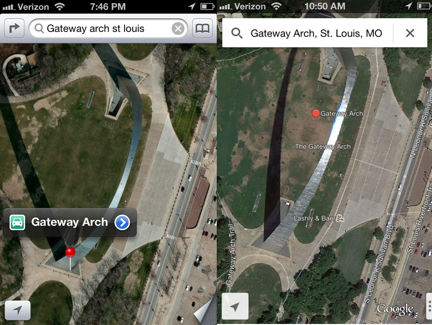
Lastly, there’s the labeling. When it comes to actually using the maps provided by each application for actual navigational purposes, Apple seems to come up short. As you see in the White House photos, Google provides a lot of labels. Who knew there was a White House basketball court? Not me, but thanks Google! Even though there is significantly more labeling on the Google side, it’s done in such a clean and tasteful way that the image is not obstructed at all. Apple, though lacking completely in regards to labels in this photo, has a tendency to place their labels right over points of interest. For instance, take a look at this side-by-side comparison of the Gateway Arch in St. Louis.
See what I mean? Google, though it has infinitely more labels, has exercised a lot of tact when it comes to placement. Yes, there are seven labels as opposed to Apple’s one, but none of them blatantly obstruct the view of the landmark and all of them are extremely informational when it comes to actually having to navigate the area. When comparing this to Apple’s photo, clearly, Google is the winner again. With all the grace of a bulldozer, Apple has plopped their one massive and way-too-obvious-to-be-informational label right on top of the point of interest.
In all, I have no problem understanding why Google is the top dog here. Their company has been doing this for years. They have a major head start in the map department and it shows. Their recent app is fast, accurate and all around awesome. Given the time that Apple had to throw their map project together, I would say that their app functions well and is overall a decent way to navigate given no other option. Google, however, has given us that option and it might just bring about a ruinous end to the ‘Apple Maps’ era.


